Logos are extremely important to any business. They're what sticks in a person's mind for potentially years, hopefully encouraging them to use your company in the future.
But even though a logo may seem simple, there's often a really interesting story behind it!
1. Domino's Pizza
When Domino's first opened, it was actually called DomiNicks, owned by Tom and James Monaghan. Tom eventually bought out his brother's half, and renamed it to Domino's. The idea behind the logo was to add a new dot every time a franchise opened, but after a year there were so many locations it would have been impossible.
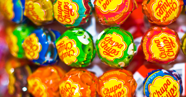
2. Chupa Chups
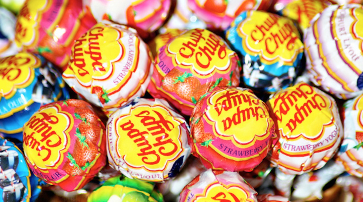
Is there a more iconic lollipop than the Chupa Chup? Around since the late 1950s, they're a staple in every kid's Halloween trick-or-treat bag. However, you may be surprised to learn that the logo was actually designed by Salvador Dali. Yes, that Salvador Dali. The artist was good friends with Chupa Chups founder Enric Bernat, and in less than an hour he had designed the logo over lunch. His masterpiece was designed to appear on top of the candy, as opposed to on the side, so it would always be visible.
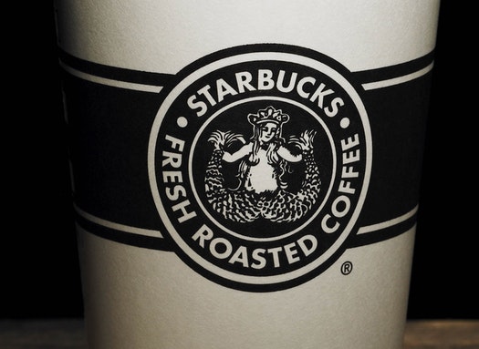
3. Starbucks
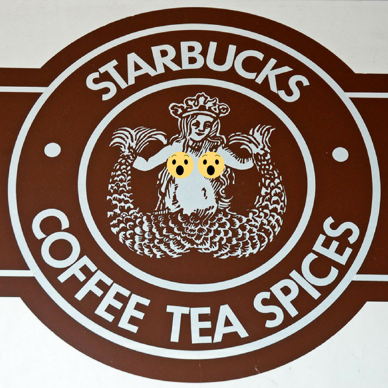
When it first came out, the Starbucks logo was based off of a siren from the 16th century with its full breasts showing. Obviously, during the next re-design, changes were made to the logo to make it more...family friendly. However, in 2008, the coffee chain released a 'vintage' line of coffee cups and people got REALLY mad about the old logo, even though the full breasts were not visible.
4. McDonald's
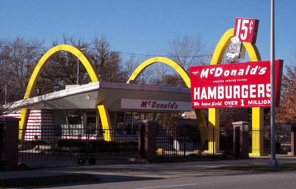
Though we all think the golden arches are representative of the letter 'M', that's actually not the case. The shape actually is a nod to the original shape of the restaurant, which featured golden archways to make the buildings stand out!
5. Apple
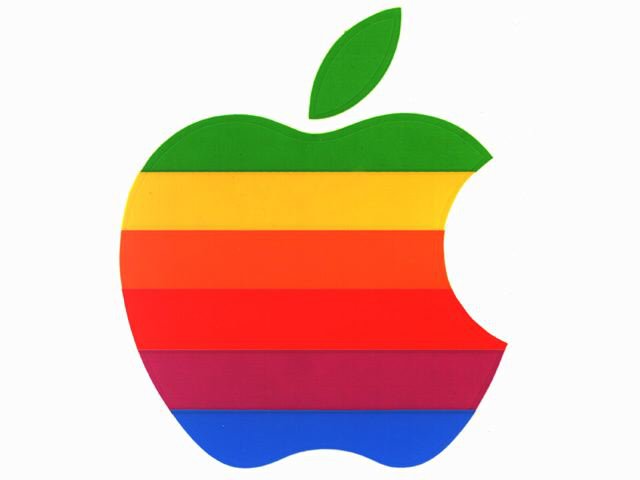
There's really no interesting reason as to why the logo is an apple, other than that Steve Jobs was on an all fruit diet at the time and thought the word sounded 'fun'. That being said, there's a reason why the apple has a bite taken out of it. Rob Janoff, who designed the logo, says it's so that users wouldn't mistake it for a cherry.
6. Windows
The old windows logo looked remarkably like a flag, which is ultimately why they had to change it. Microsoft hired a graphic designer to redo their logo, and the first thing they said was "Your name is Windows. Why are you a flag?" That's when Microsoft went to their new, more basic deisgn.

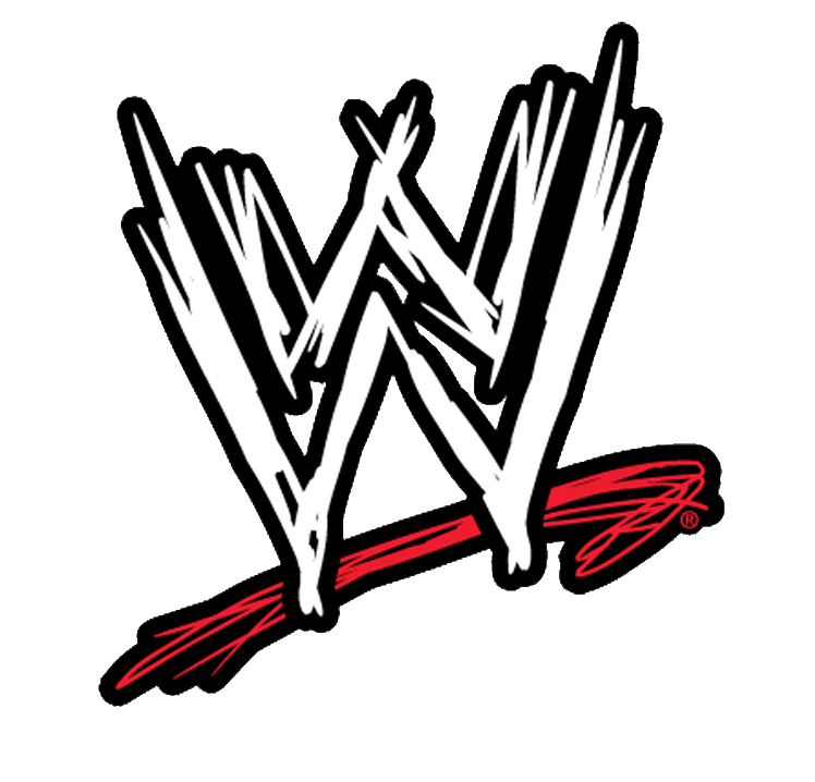
7. WWF/WWE
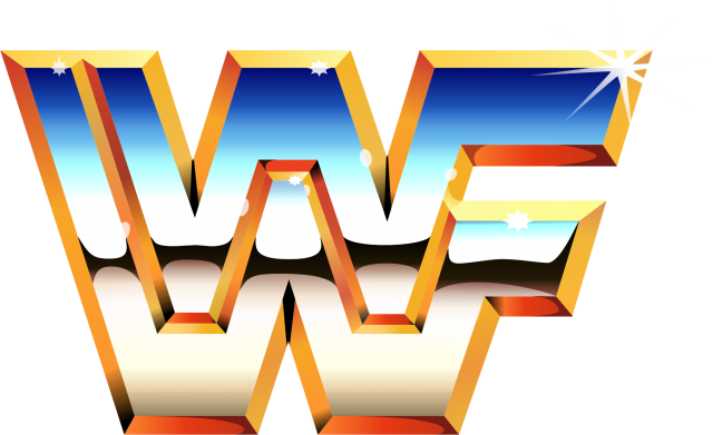
The World Wrestling Federation and the World Wildlife Foundation argued for 18 years over who was actually allowed to use the acronym. But here's the thing. In the 90s, the World Wrestling Foundation changed to World Wrestling Entertainment but the two companies still battled it out until 2012 over who got to officially use "WWF." As a surprised to no one, the pandas won.
9. Disney
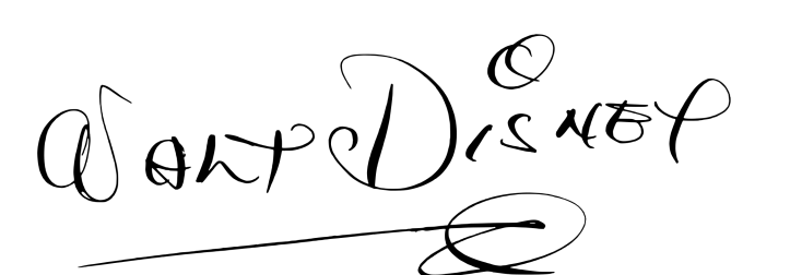
The Disney logo may be based off of Walt Disney's signature, but that doesn't mean he was good at drawing it. When fan mail would come in, Walt Disney would often pass off the job of autographs to his secretary, as he was far too busy to do it himself. At some point, there were more 'fake' Disney signatures around than real ones. It's hard to find a legitimate copy of Walt Disney's signature, however, because he was always trying to make it as stylized as the one in the logo...but he could never quite figure it out.
10. MGM Lion
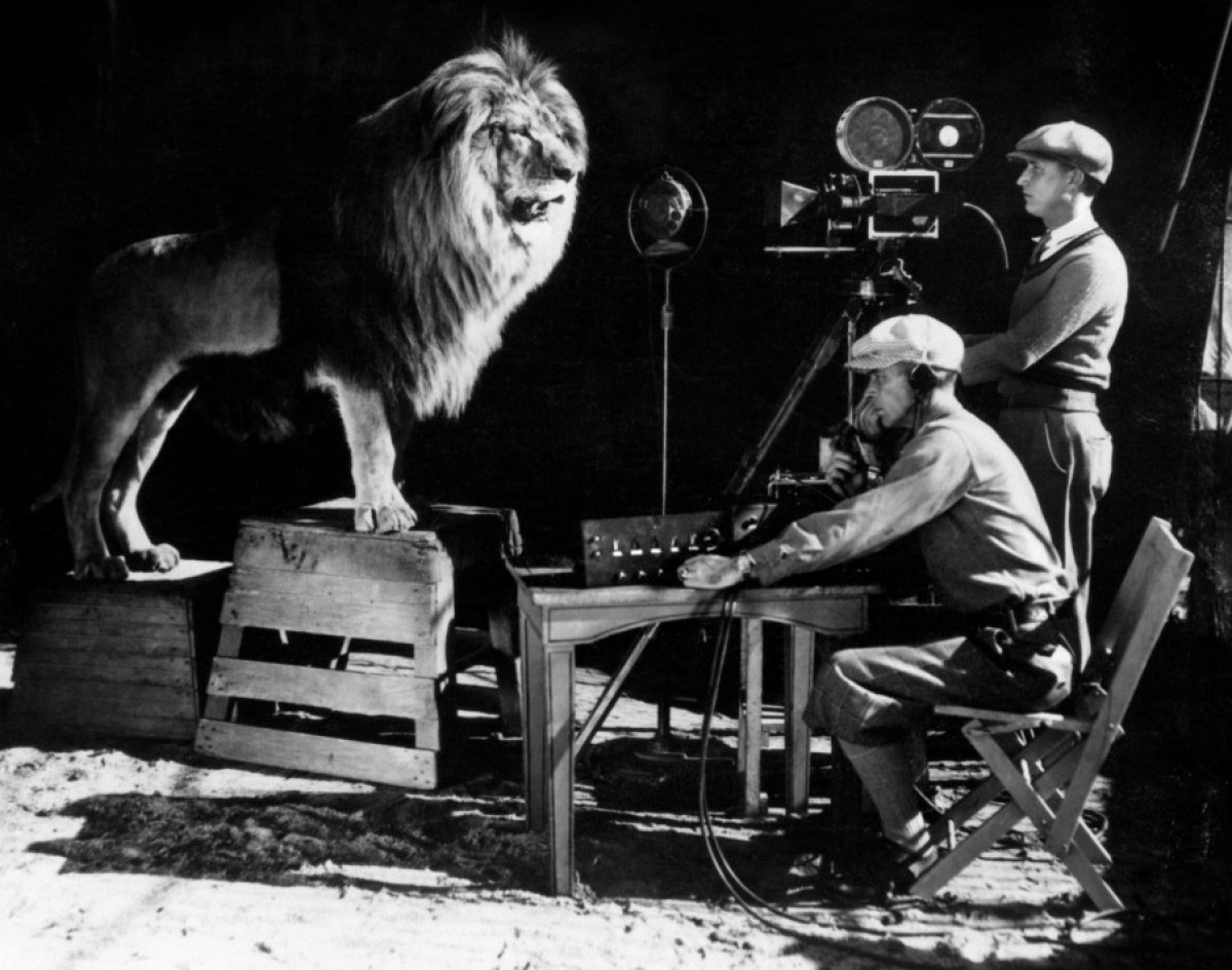
There were four lions that ultimately filmed the MGM logo over time, each of them with their own history. The second lion used by MGM, named Jackie, survived a train crash, a plane crash, an explosion, a boat crash, an earthquake, and another train crash. He also adopted a bunch of kittens that were left without a mother. Talk about nine lives!
Did you know any of these stories?
