Whether we like it or not, mascots are a big part of our lives. We may not remember the capital of Romania off the top of our heads, but there's no doubt every man, woman and child in America knows Tony the Tiger's catchphrase by heart.
But why are all these characters so memorable? It has a lot to do with their great designs. Take Mr. Clean for example, if he hadn't been designed with the sparkling white outfit that showed just how clean he could make your home, he probably wouldn't be world-famous today.
So it can be pretty surprising to look up the first appearances of some iconic mascots and see just how different they used to look. Compare the changes these characters have been through and it should be clear why the improved designs are so much better.
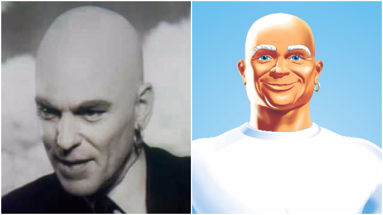
Mr. Clean wore a suit?
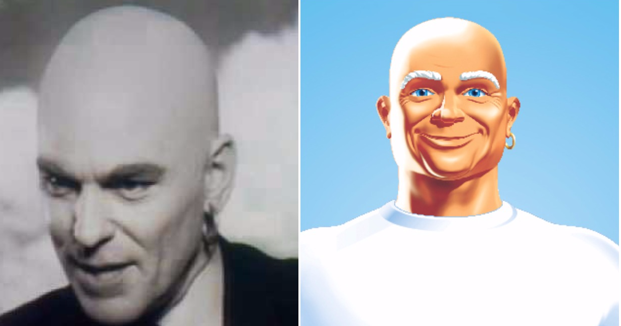
The man who represents a clean, sparkling kitchen to families around the world was based on a sailor from Florida, which is why he has such a brawny look.
While he appeared as a cartoon character at first, there were a few commercials in the 1960s where Mr. Clean was played by actor Mark Dana.
I can't decide what's stranger about this ad: the scary, dark suit Mr. Clean is wearing, or the fact that he talks in this ad.
Ronald McDonald was a creepy clown
It's easy to see why this early design, with Ronald wearing an outfit made from McDonald's boxes, wasn't a hit with customers.
Ronald was originally played by Willard Scott, the same actor who starred as the famous Bozo the Clown.
Miss Chiquita was more a-peel-ing
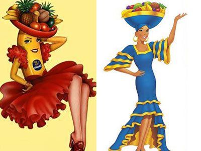
If you love bananas you probably have a few stickers with the famous Chiquita banana lady stuck to your desk, so it may come as a shock that the mascot was once a real banana lady.
The brand introduced the human version of Miss Chiquita in 1987.
Can you recognize these elves?
Snap, Crackle and Pop looked more like triplets than brothers in this vintage add. They got a makeover in the 1940s, with the unique designs that make them easy to recognize, and haven't changed much since then.
The Jolly Yellow Giant
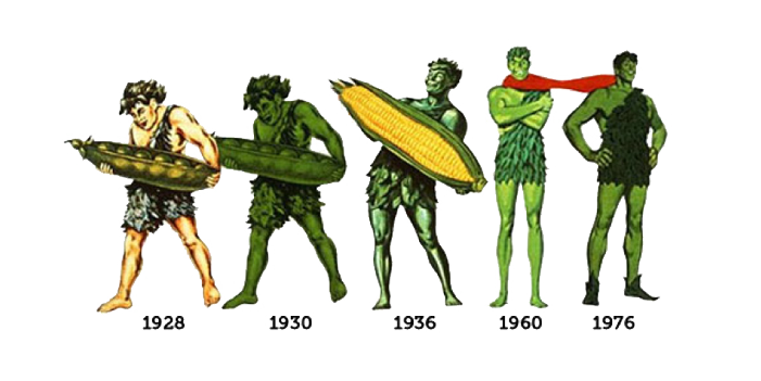
Yes, it's hard to believe but the Green Giant wasn't always green! The classic character, who was named for a type of very large green peas sold by the Minnesota Valley Canning Company, has also grown a few feet over the years.
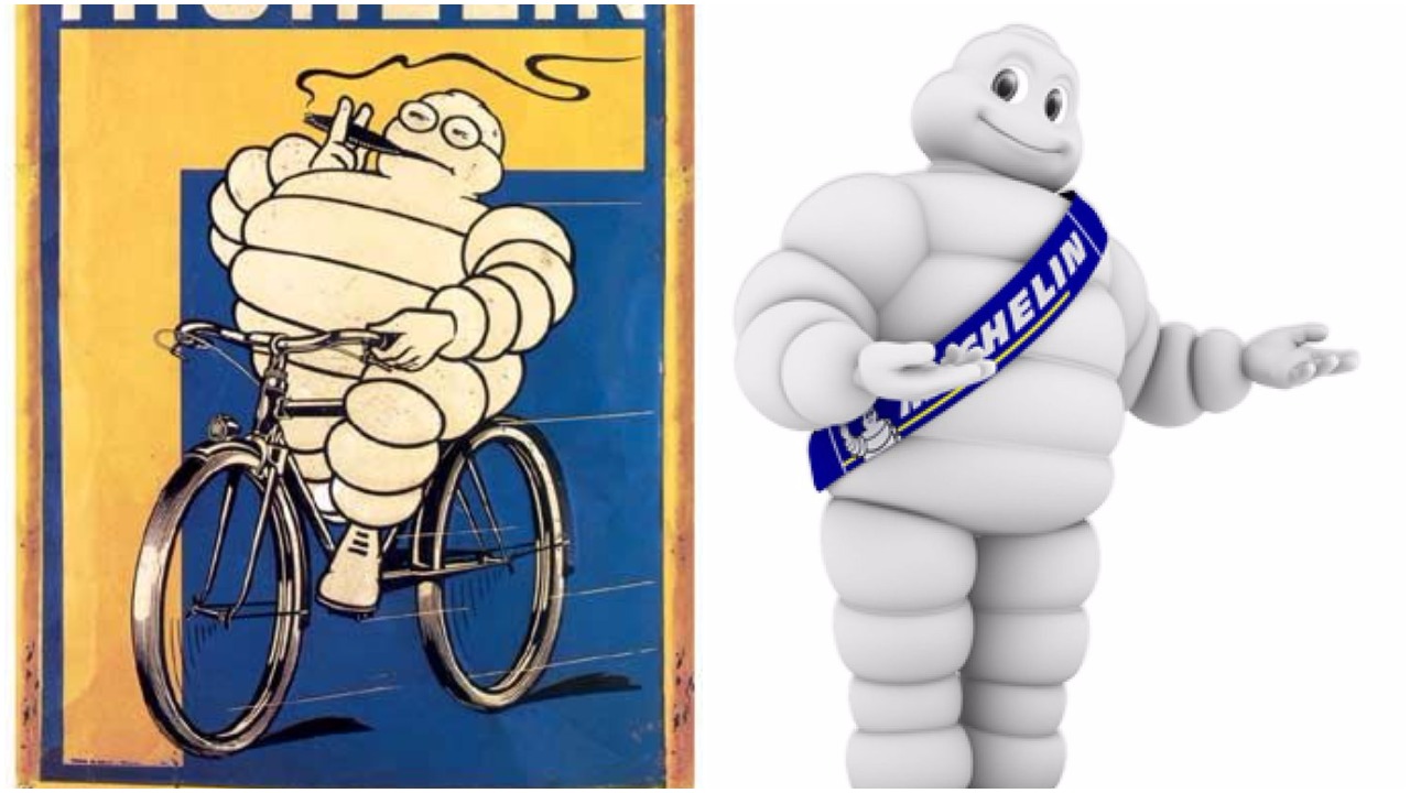
Bibendum gave up a few bad habits
This jolly tire-man first appeared way back 1894, and he's changed shape a few times since then.
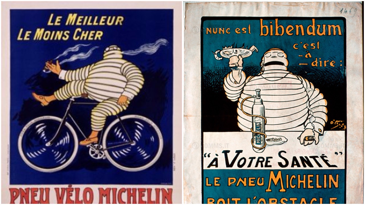
Originally, he liked to smoke a cigar and drink broken glass and nails (to demonstrate how tough Michelin tires are).
But since adopting a healthier lifestyle Bibendum has slimmed down quite a bit.
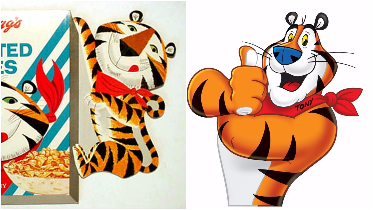
Tony the Tiger actually retired
Most people claim that Tony the Tiger has put on a few pounds of muscle since he first appeared in the 50s, but that's not true.
See that mischievous tiger cub in the commercial? He's Tony's son, Tony Jr. That's the tiger on our cereal boxes today.
The two are very different - Tony is serious while Tony Jr. is sporty - but they both have the same catchphrase and deep voice. It's easy to see the family resemblance.
Do you remember any of these early designs? Share this post and let us know!