From the moment we open our eyes in the morning until we go to bed at night, we're constantly surrounded by logos. They're an ever-present part of everything we do on a daily basis, from the clothes we wear to the food we eat.
Even if you aren't paying too much attention to the logos you come across every day, you can't totally avoid them because many are designed to stand out and target the subconscious brain.
Basically, brands don't choose their logos and store signs by chance. There's a psychology behind every design and this is why certain brands attract us more than others.
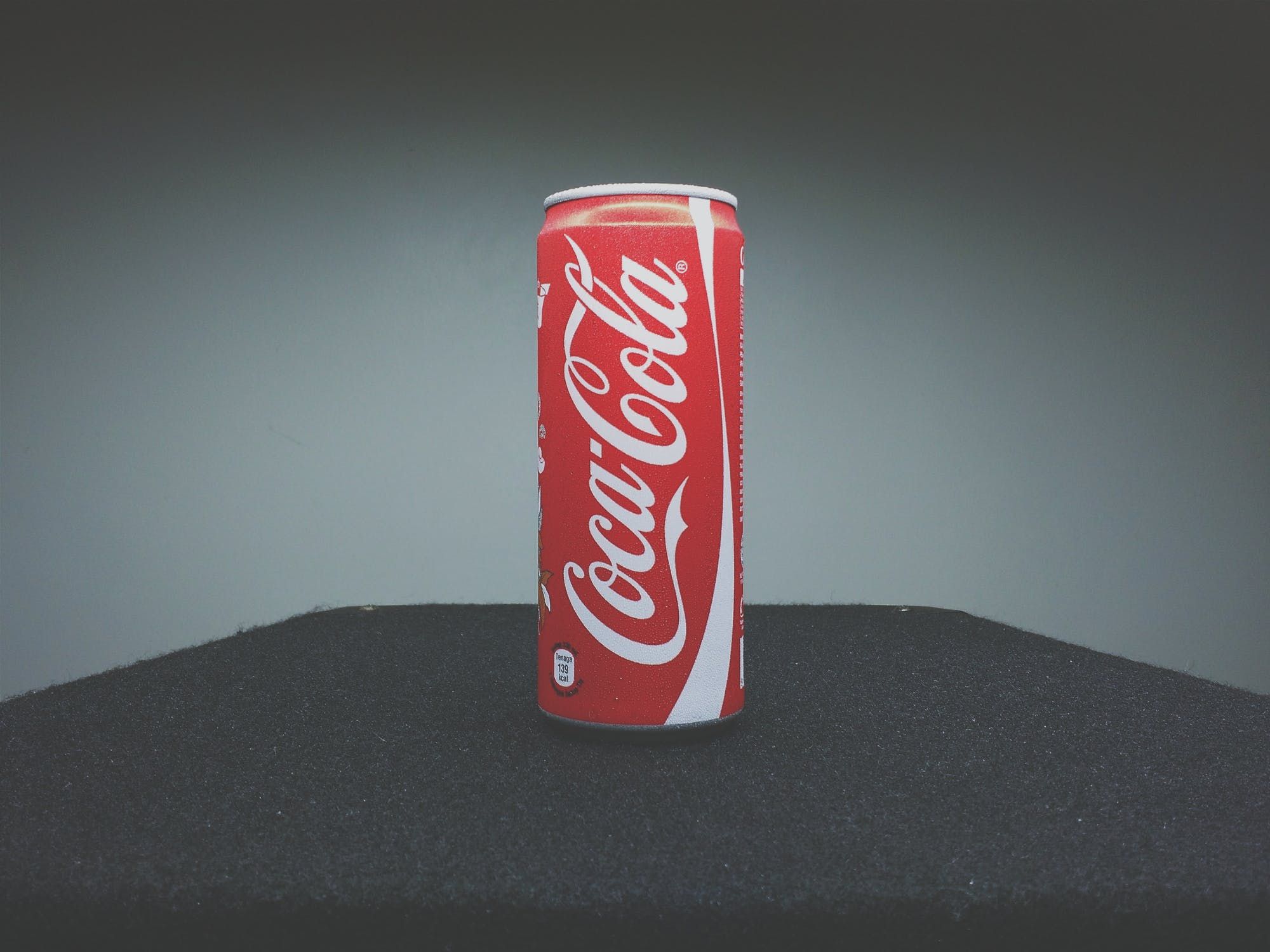
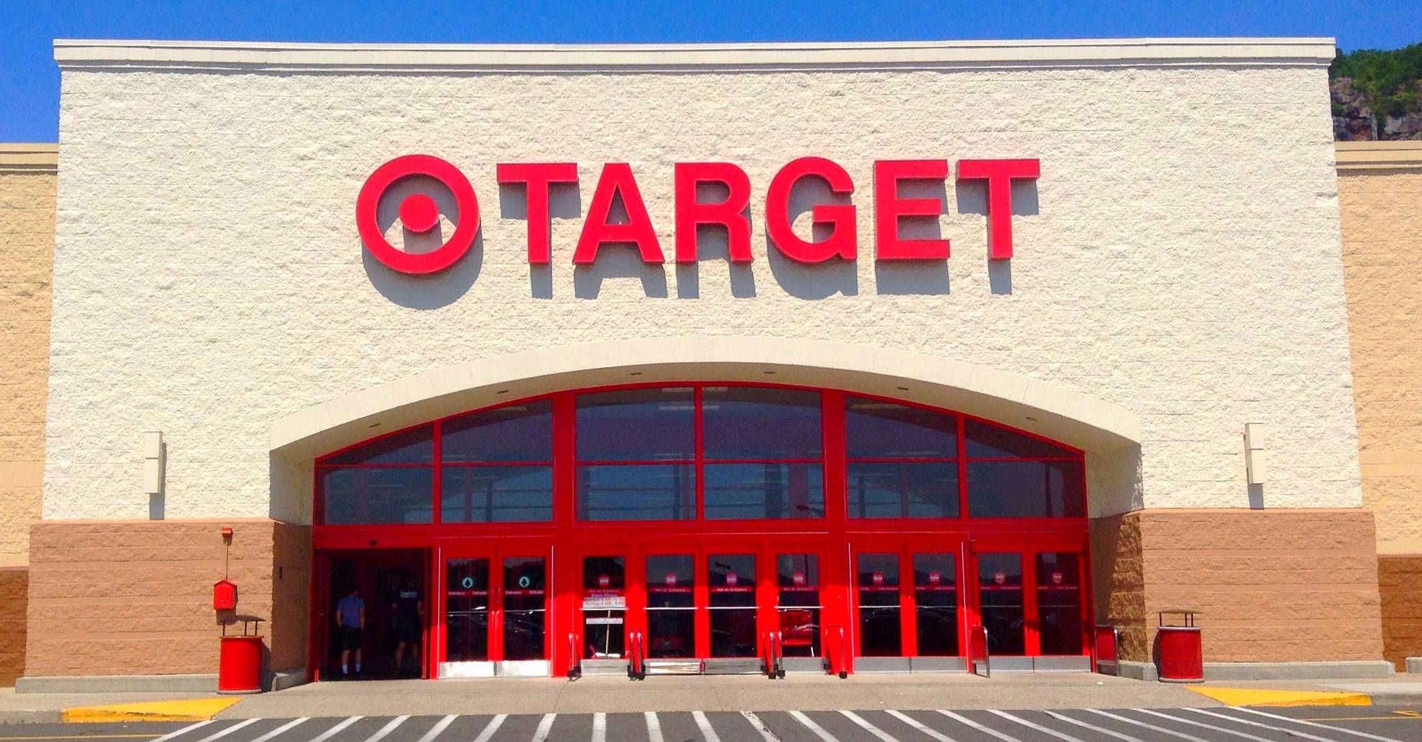
One thing some of the world's biggest and most successful brands have in common is the color of their logos. So many of them have logos that are either fully or partially red.
Target, McDonalds, Netflix, YouTube, Coca-Cola, Toyota, Costco, Virgin, CNN, and Nintendo are all brands that have red in their color schemes.
The striking primary color is also often seen on store windows during sales and special events, but did you ever stop to wonder why?
Well, color is one of the most important part of marketing, and besides, red sells. According to the digital marketing firm WebpageFX, it takes under two minutes for a person to pass judgement about an object or another person, and 90% of this first impression is based on color alone.
So brands use red as it evokes a visceral reaction. The color, which is usually associated with danger, increases heart rate and "creates a sense of urgency" to make a purchase, according to Emily Carter, a WebpageFX marketing analyst.
"This is why you'll often see red tags for clearance sales," she continues. "The color red is also said to stimulate appetite, and it's used by a number of restaurants, food, and beverage brands like McDonald's, Coca-Cola, and Kellogg's."
In a study published in the journal Emotion, researchers Andrew Elliot and Markus Maier echo Carter's explanation. They found that people react faster and with more vigor when they see the color red.
Regardless of the message a brand is trying to convey, red always works because it is attention-grabbing and triggers strong emotions. In some ways it can be an aggressive color, but it is also associated with love and comfort (think Valentine's Day), and excitement.
Red is also the most visible color to the human eye as our photo receptors are sensitive to long wavelength light. This is one of the reasons why emergency vehicles are often painted red.
Bevil Conway, a neuroscientist argues that red is a "special color" because "of all of the colors, across all of the world, in all of the world's languages, we communicate red most efficiently."
The versatility of the color is why it has worked well for so many brands over the years.
Take a look around you and try to see how many red logos you can spot, there are more than you realized.
